
Service Design / UX Research / Branding / Spatial Concept
Project
Chung-Ang University · Service design course project
Period
Sep–Dec 2021
Role
User research
Service planning
Branding
Spatial concept
Tools
Cinema 4D
Redshift
Photoshop
00 — Overview

01 — Objective
Make small-quantity fresh-food shopping convenient for people living alone
02 — Design Criteria
Connect price, portion size, and access with sustainability
03 — Deliverables
Service concept · Brand system · Store layout and blueprint
01 — Context
Produce discarded in Korea every year
Estimated annual loss, plus ₩600B in disposal costs
Fresh ingredients, without the burden of buying in bulk.
대량 구매의 부담 없이, 신선한 식재료를.
For people living alone, package size and storage space matter alongside price. Between bulk groceries and ready-made meals, the project explores a nearby place to buy smaller quantities of fresh food.
ASAK connects this need with imperfect produce. The concept pairs its environmental purpose with practical reasons to choose it: price, quantity, and ease of use.
PESA scan
PESA 분석
P
Political
정치
No strict rules on over-packaging yet. The government supports processing four kinds of off-spec produce.
E
Economic
경제
Subscriptions and unmanned stores are growing. Summer heat spikes vegetable prices, and off-grade rulings cost farms up to ₩5T a year.
S
Social
사회
Delivery culture, low vegetable intake, and a post-COVID shift to shopping close to home. Convenience comes first.
A
Awareness
인식
Value-driven and ethical consumption is rising, along with frustration at excessive produce packaging.
Where the market falls short
시장이 채우지 못한 부분
OVERSEAS · 해외
Imperfect produce as a mainstream choice
Intermarché in France, Kromkommer in the Netherlands, and ASDA in the UK sell off-spec produce openly, some under their own brand.
KOREA · ONLINE · 국내 온라인
Boxes too big for one person
Services like Ugly Us and Fresh Ugly ship bundled boxes. Quantities suit families, not someone cooking alone.
KOREA · OFFLINE — THE GAP · 국내 오프라인의 빈틈
Almost nowhere to see it in person
Specialist stores such as Refurb 14 are rare. Without a place to see and pick produce, people can’t judge quality or buy just enough.
PROBLEM FRAMING · 문제 정의
How might we make imperfect produce the easy choice for people who live alone — close to home, at a fair price, in the amount they’ll actually eat?
Target: MZ-generation single-person households. Goal: raise access through an offline food refurb store, and shift how people see B-grade produce.

02 — Approach
Research at a glance
리서치 한눈에 보기
01
Discover — research beyond the desk
02
Define — four personas, one shared need
03
Develop — from values to objects
04
Deliver — one store, one brand
What we found
리서치에서 발견한 것
SURVEY · n=43
Aware, but not buying
60.4% know what imperfect produce is, yet 79.1% have never bought it. 60.4% know what imperfect produce is, yet 79.1% have never bought it.
Everyone who had bought it was satisfied.
Insight: awareness isn’t the barrier. Access and portion size are.
PEER SHADOWING · SUPERMARKET · 대형마트 피어 섀도잉
Convenience costs a premium
Pre-cut green onion: ₩2,480 for 4 stalks. A whole bunch: also ₩2,480. Pre-cut onions: 2 for ₩2,980. Whole onions: 6–7 (1 kg) for ₩1,980.
Packing was rushed once the next customer arrived at checkout.
Insight: loose produce is the better deal, if prep and packing weren’t a hassle.
SERVICE SAFARI · THE PICKER · 더피커 서비스 사파리
Imperfect produce needs explaining
Too little product information to trust what was on sale. No tongs, so soil-covered produce had to be handled by hand.
Products and decor were hard to tell apart, and a busy cashier slowed even small purchases.
Insight: guide people through the store, and make checkout self-serve.
Journey map: where each persona’s mood dropped
페르소나 4인
강
Kang, 25 · Job seeker
Value seeker · 가성비 추구형
“I can’t just skip a proper meal. What should I cook today?”
Needs: new vegetables at a fair price, less packaging waste, a quicker checkout
사
Sa, 30 · Office worker
Value seeker · 가성비 추구형
“Overtime wears me out, and cooking is hard.”
Needs: easy prep guides, only basic kitchen tools, a store still open after work
김
Kim, 20 · Student
Practical · 실용형
“Minimum effort, maximum payoff.”
Needs: single-serve portions and clear cues on what to pick
나
Na, 28 · Influencer
Trend seeker · my persona · 트렌드 추구형 · 담당 퍼소나
“Grocery shopping, but make it trendy.”
Needs: eye-catching copy and illustration, reusable containers, goods worth sharing
Two shared lows. At price comparison, all four were unsure how loose produce compared with pre-packed. After getting home, three didn’t know how to store what they bought, and Kang was frustrated by packaging waste.
From insight to zone
인사이트를 바탕으로 도출한 솔루션
INSIGHT
SOLUTION
강
NA · BEGINNER · 입문자
Clean baskets · self-checkout corner · payment guide · easier checkout
Self-checkout kiosk
셀프 계산 키오스크
Weigh exactly what you picked and pay without waiting on staff.
사
KO · COLLECTOR · 수집가
In-store map · washing booth · storage guidebook · food-sharing community
Washing booth
세척 부스
Wash and trim produce in store, with tools and a step-by-step prep guide.
김
DO · TREND SEEKER · 트렌드 추구형
A route that follows how people shop · info displays · simple storage · flexible payment
Produce guideline
농산물 가이드라인
Beginner and expert routes, with displays explaining each item and how to use it.
나
PARK · SOLO READER · 혼독족
Eco packaging · reusable containers · participatory events · identity goods · QR info tags
Brand goods
브랜드 굿즈
Asaki, a storage container, and a mesh bag that make the store worth remembering.
03 — Design Decisions
Key decisions and why they mattered
핵심 결정과 그 이유
Values we designed for (E3 Value)
우리가 설계한 가치 (E3 Value)
ECONOMIC · 경제적 가치
Fair portions and prices
합리적인 양과 가격
Surplus produce becomes farm income, and reaching single-person and MZ shoppers strengthens the vegetable market.
ECOLOGICAL · 환경적 가치
Less single-use packaging
일회용 포장 줄이기
Loose items, reusable bags, and storage containers replace plastic at checkout.
EXPERIENCE · 경험적 가치
Easy to try, good to return to
시도하기 쉽고, 다시 오고 싶은
Functional: clear layout and information, buy by the piece. Social: a trend-leading place worth sharing. Emotional: trustworthy, convenient, and meaningful.

01 — Name and identity
A name you can hear.
asak is the crunch of a fresh vegetable, and the exclamation mark makes it pop. Green and black stand for freshness, yellow sparks appetite, and translucent materials carry the brand values: honest and confident.
Design Decisions · 01
Brand values
브랜드 가치
Honest · 솔직함
+
Confident · 자신감
→
Translucent · 반투명
Nothing to hide about imperfect produce. Translucent materials across the goods and store show what’s inside.
Color system
컬러 시스템
Green · freshness — 초록 · 신선함
White · clarity — 흰색 · 명료함
Black · soil — 검정 · 흙
Yellow · appetite — 노랑 · 식욕
02 — Store route
Six zones, one route.
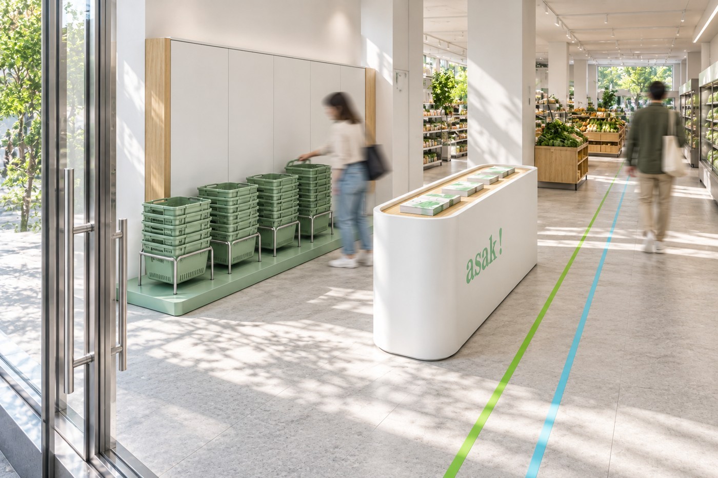
An entrance with a guide leaflet, produce aisles with clear signage, a challenge zone, the goods zone, self-checkout, and a washing booth for prep. Each zone answers a low point from the journey maps.
Design Decisions · 02

Service blueprint: six stages, front to back
서비스 블루프린트: 여섯 단계, 앞에서 뒤까지 · 단계에 마우스를 올려보세요

Scarred,
still fresh.
상처 나도, 여전히 신선하게.
03 — Brand goods
Goods that replace the plastic bag.
At checkout, loose produce ended up in single-use bags. I designed three goods for the trend-seeking persona: Asaki, a mascot based on a scarred green onion; a silicone container for prepped vegetables; and a reusable mesh bag. They carry the store home and give people a reason to come back.
Design Decisions · 03

Storage container
보관 용기
Waterproof, reusable silicone, sized for vegetables prepped in the store.

Mesh bag
메쉬백
Organic cotton mesh that replaces single-use bags and works as an everyday bag.

Asaki figure
아삭이 피규어
A character based on a scarred green onion. Imperfect, and still likable.
Idea sketches: form, interaction, details
아이디어 스케치: 형태, 인터랙션, 디테일
Before modeling, I sketched the goods in three passes: the overall form of the mesh bag and storage pouch, how hands open, carry and pack them, and the details that carry the brand — drawstring, zipper, gusset, and the asak! label.

01 · FORM · 형태
Mesh bag, pouch, and Asaki
메쉬백, 파우치, 아삭이
Overall proportions and how the three goods sit together as a set.

02 · INTERACTION · 인터랙션
Open, carry, pack
열고, 들고, 담기
Pulling the drawstring with two hands, scooping produce in, and zipping the pouch closed.

03 · DETAILS · 디테일
Drawstring, zipper, gusset, label
조임끈, 지퍼, 바닥 주름, 라벨
The braided cord and stopper knots, the zip closure, the folded base, and the green asak! tag.
AS-IS · CAM · 기존
Checkout ends in a plastic bag
비닐봉지로 끝나는 계산
Staff pack loose produce into single-use bags. Customers leave with waste, sore fingers from thin handles, and nothing that recalls the store.
TO-BE · CAM · 개선
Checkout ends with brand goods
브랜드 굿즈로 끝나는 계산
Produce goes into a reusable bag or container. The goods keep the brand in view at home and give people a reason to come back.
04 — Outcome
Outcomes and learning
결과와 배운 점
Four team outputs came together as one brand, asak!: a store concept for single-person households, a six-zone route, a service blueprint, and a set of brand goods. We kept refining color and form until four very different pieces read as one brand. My part covered the trend-seeker persona and the goods: Asaki, the storage container, and the mesh bag.
Expected impact
기대 효과
ENVIRONMENT · 환경
Less methane from burned produce
Selling off-spec produce keeps it from being burned, cutting the methane that speeds up global warming.
FARMS · 농가
Income from produce once written off
B-grade crops earn a fair price instead of disposal costs.
PERCEPTION · 인식
Valued for quality, not shape
Shoppers act on their values and see irregular produce as real food.
SINGLE-PERSON HOUSEHOLDS · 1인 가구
Buy only what you’ll eat
Less food thrown out before its date, and the same quality for less.
Learning
Learning each method before using it made the work sharper. We met the day after every critique to study the next method together, so everyone applied it with the same intent. E3 Value was the most useful: grouping emotional values and linking them to functional ones produced insights that fed straight into the outputs.
Prototyping was the hardest part. My first figure prototype was only compared with store-bought figures, so I rebuilt it, tested it by hand, and fed the changes back into the 3D model. Next time I’d prototype earlier and more often.
Next Project · 다음 프로젝트
Hublot Ver.1
→
Copyright © Sydney Hong 2026
Try
Framer
for Free!